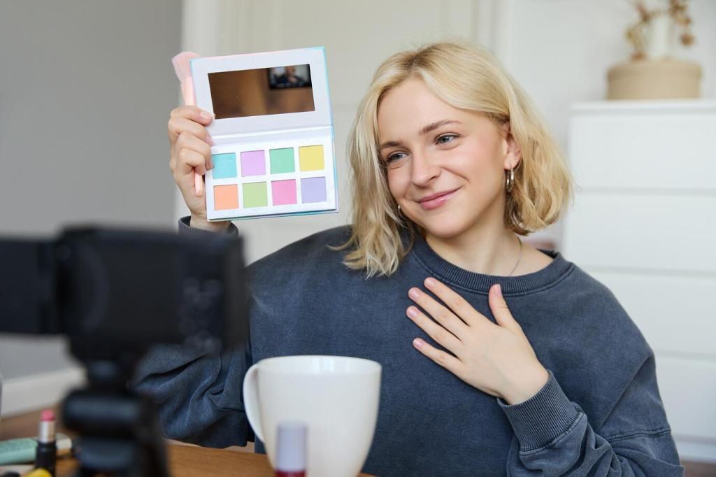
Tailoring Color Palettes for Landscape Photography

Welcome to a creative deep dive into tailoring color palettes for landscape photography, where light, weather, and terrain become a painter’s kit. Discover how intentional color choices turn ordinary scenes into unforgettable visual stories.

Building a Custom Palette On Location

Walk slowly and list five colors you actually see, not those you expect. Use your phone to sample tones, or photograph swatches like rocks, leaves, and sky patches to verify the palette you’ll emphasize.

Building a Custom Palette On Location

Assign roles to colors by depth: fore for textured warmth, mid for transitional neutrals, and background for cooling hues. This hierarchy keeps your tailored palette coherent, guiding both exposure decisions and viewer attention.

This is the heading

Lorem ipsum dolor sit amet, consectetur adipiscing elit. Ut elit tellus, luctus nec ullamcorper mattis, pulvinar dapibus leo.

This is the heading

Lorem ipsum dolor sit amet, consectetur adipiscing elit. Ut elit tellus, luctus nec ullamcorper mattis, pulvinar dapibus leo.

Lens Filters and In-Camera Tools

Polarizers for Purity

A circular polarizer cuts glare on water and leaves, restoring true saturation to greens and blues. By reducing specular highlights, your tailored palette holds together without muddy reflections stealing attention or skewing hue balance.

Graduated NDs to Harmonize Sky and Land

If a bright sky overwhelms your foreground tones, a soft grad ND preserves sky color without crushing shadows. The result is a balanced palette where sky and earth share equal, intentional voice.

Picture Profiles and In-Camera Styles

Neutral or Flat profiles preserve headroom, but custom styles can nudge warmth or contrast for your intended palette. Keep a palette-specific preset so your landscape series feels cohesive from frame one.

Compositional Color Strategies

Choose a dominant color family to anchor the frame, then introduce a small, high-value accent. A field of sage greens punctuated by a lone crimson tent creates tension that feels deliberate, not accidental.

Compositional Color Strategies

Blue-orange, red-cyan, and green-magenta pairings create energy. Use complements sparingly to avoid chaos, letting one color lead while the other provides a controlled counterpoint that supports your tailored landscape palette.

Compositional Color Strategies

Rivers, ridgelines, and flower bands naturally guide the eye. Align these color pathways to your subject so the palette pulls viewers forward, reinforcing narrative without overreliance on high contrast or heavy sharpening.

Selective HSL Sculpting

Target specific hues using HSL panels to nudge saturation and luminance while protecting neighboring tones. Small, local adjustments maintain believability and keep your landscape’s tailored palette both refined and authentic.

Color Grading with Wheels or Toning

Use midtones for narrative warmth, shadows for atmospheric cool, and highlights for cohesion. Subtle grading knits disparate elements into a single palette, turning scattered colors into a considered, unified experience.

Stories from the Field: Palettes That Changed the Shot

In Provence, thunderheads rolled over violet rows. I cooled white balance and lifted magentas slightly, letting lavender lead while storm grays supported. The restrained palette made the drama believable, not theatrical.

Stories from the Field: Palettes That Changed the Shot

On an overcast day at a glacial lagoon, a polarizer revealed deep ceruleans hiding beneath glare. By muting surrounding greens, the ice’s blue narrative took center stage and the image finally breathed.

Your Turn: Practice, Share, and Grow

01
Create a small notebook or notes app entry for each shoot, listing three dominant hues, two supporting tones, and one accent. Revisit entries to see your tailored landscape palette evolving over time.
02
Post two images from the same location with different palette intentions and ask followers which mood resonates. Invite feedback on white balance, dominant hue, and accent placement to refine your approach.
03
Join our monthly challenges focused on tailoring color palettes for landscape photography—fog days, desert dawns, alpine shade. Subscribe to receive prompts, field checklists, and community critiques that strengthen your color voice.
Prinsenbee
Privacy Overview

This website uses cookies so that we can provide you with the best user experience possible. Cookie information is stored in your browser and performs functions such as recognising you when you return to our website and helping our team to understand which sections of the website you find most interesting and useful.